EDA for Classification
Exploratory Data Analysis, or EDA for short, is the process of exploring and visualizing data to find useful patterns and insights that help inform the modeling process. Oftentimes when we’re working with classification data, we might have dozens, if not hundreds of potential features at our disposal.
So the process of EDA is largely about identifying which features are most promising and narrowing down to just a handful, at least to start, as we build a baseline model, we can always add more features later.
When performing EDA for classification, it`s important to explore:
- The target variale
- The features
- Feature-target relationships
- Feature-feature relationships
Project 1 - income prediction project
We want to be able to validate whether our customers are reporting income accurately using machine learning.
Assignment 1: EDA
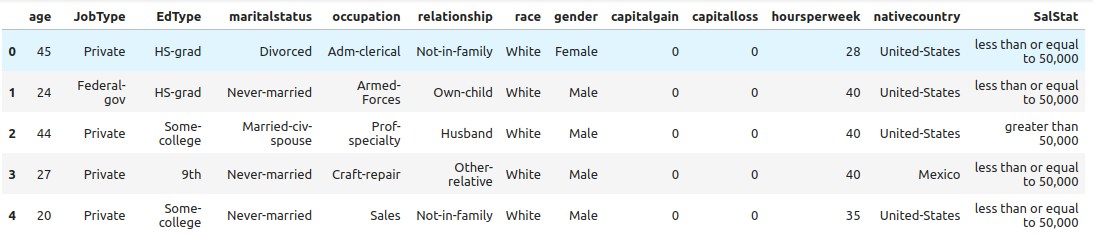
- Read in
income.csv
1
2
3
4
5
6
7
8
import pandas as pd
import numpy as np
import seaborn as sns
import matplotlib.pyplot as plt

# Read file
income = pd.read_csv("Data/income.csv")
income.head()
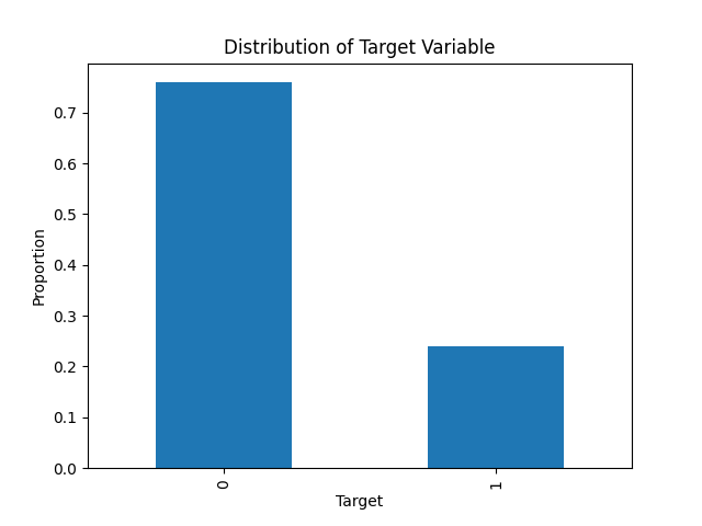
- Convert the target,
SalStatinto a binary numeric variable calledtarget, and build a bar chart that plots the frequency of each value.
1
2
3
4
5
6
7
8
9
# Convert Salt
income["target"] = np.where(income["SalStat"] == ' less than or equal to 50,000', 0, 1)

# Plot
income["target"].value_counts(normalize=True).plot.bar()
plt.title('Distribution of Target Variable')
plt.xlabel('Target')
plt.ylabel('Proportion')
plt.show()
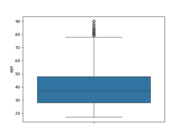
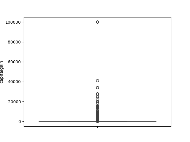
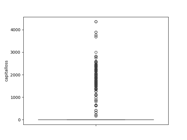
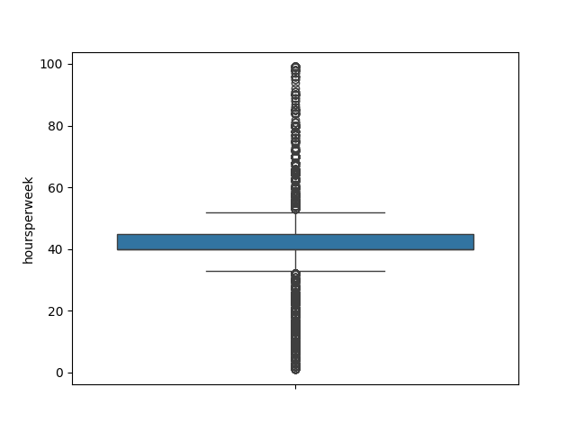
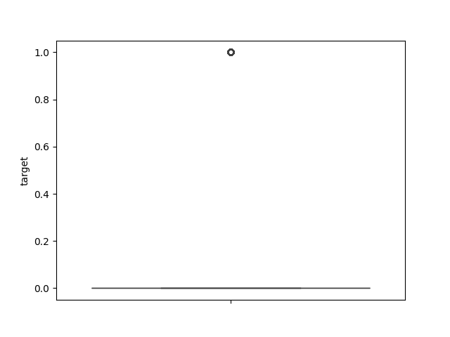
- Explore the numeric features using histograms or boxplots.
1
2
3
4
5
6
7
8
#
def num_box_plotter(data):
  for column in data.select_dtypes("number"):
  sns.boxplot(data[column]).set(ylabel=column)
  plt.show()

num_box_plotter(income)
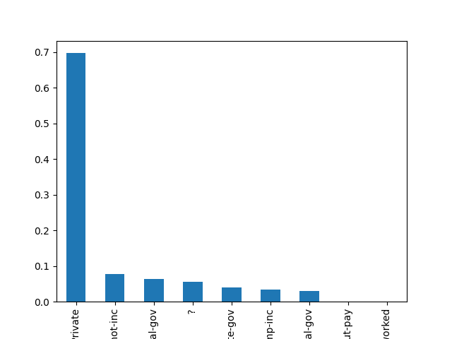
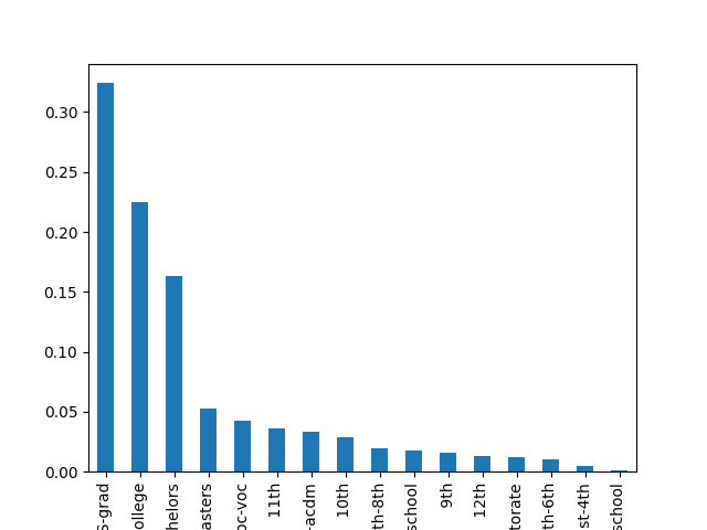
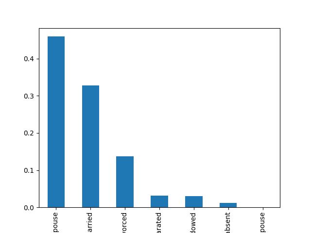
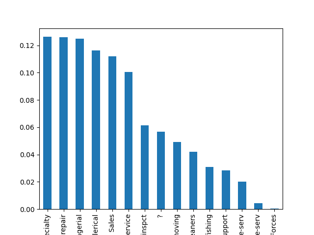
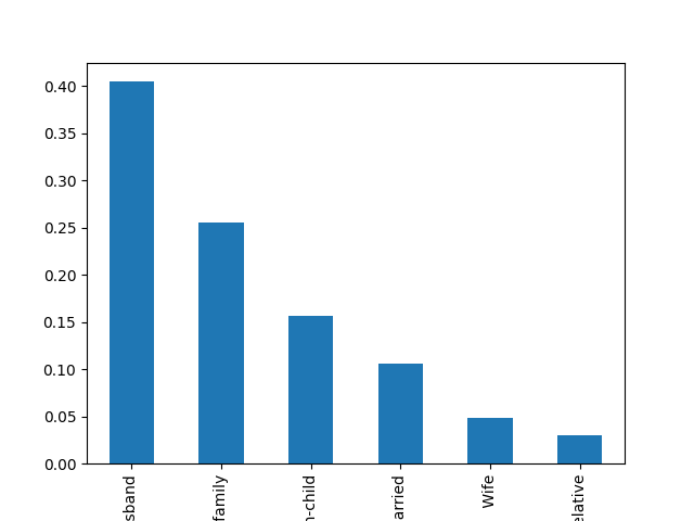
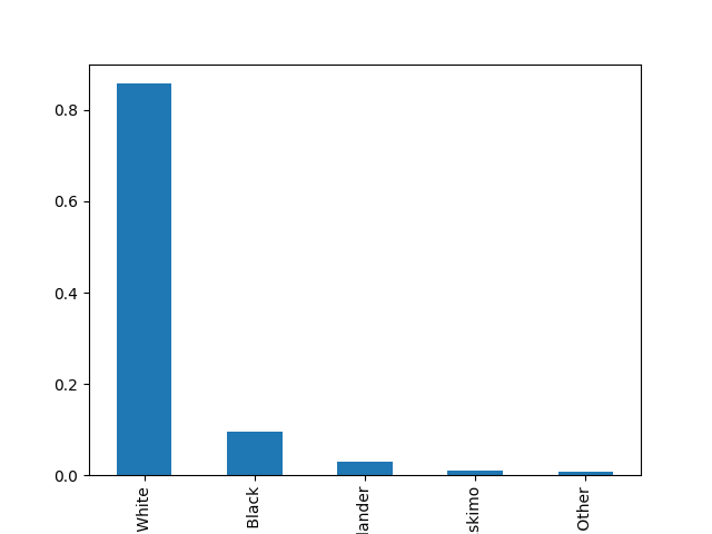
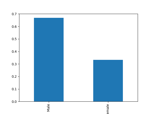
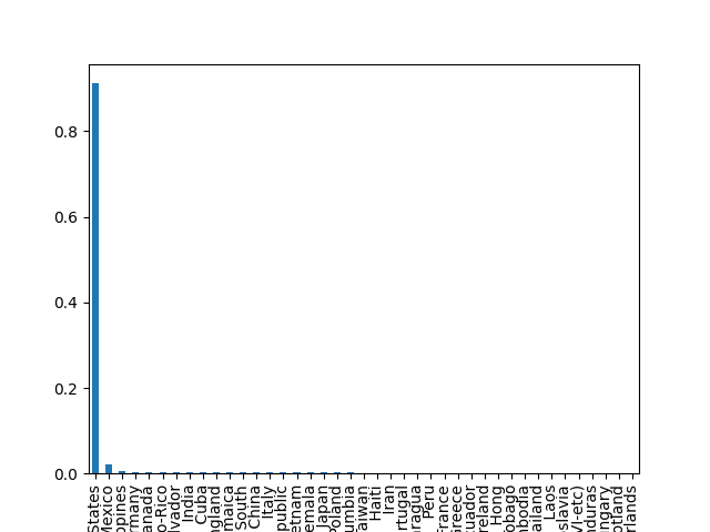
- Explore the categorical features using bar charts.
1
2
3
4
5
6
7
8
#
def cat_bar_plotter(data, normalize=False):

    for column in data.select_dtypes("object"):
        data[column].value_counts(normalize=normalize).plot.bar()
        plt.show()

cat_bar_plotter(income, normalize=True)

This post is licensed under CC BY 4.0 by the author.